What they needed:
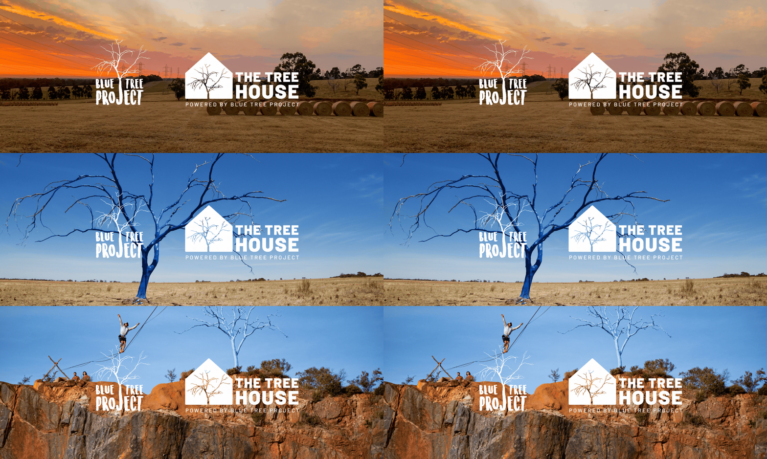
The result:
< Previous Project
Next Project >
Brand designers and strategic digital marketing for businesses in Perth, Melbourne, NZ and beyond.
CONNECT
Future Proof is a marketing studio based in Perth, combining brand identity, strategy and paid campaigns for businesses that want to grow.
We work with good people doing interesting things. If that sounds like you, we should talk.
Get in touch hello@futureproofagency.com.au
Perth Studio:
96 Hay Street, Subiaco
Western Australia 6008
Brand smarter, not harder. Sign up for fresh branding strategies that make an impact. We’ll keep it simple, insightful, and straight to the point.
ALL RIGHTS RESERVED • MADE WITH ♡ BY FUTURE PROOF AGENCY (THAT’S US)
We acknowledge the Nyoongar Whadjuk people as the traditional owners of the land we live and work on. We pay respects to Elders past, present and emerging and recognise their continuing connection to the land, waterways and community.
