EIUS Brand
What They Needed:
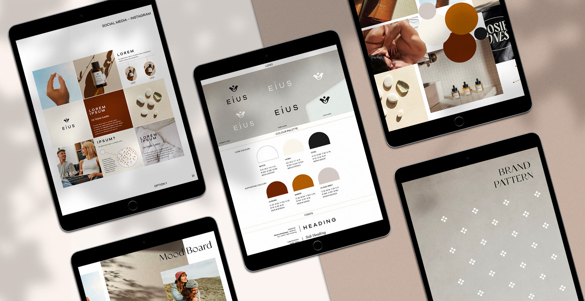
A brand strategy and brand design that is tailored to expecting mothers and parents. We evolved EIUS from its former identity as a natural, alternative supplement that embodied a highly maternal, feminine tone of voice. Moving towards a concise, androgynous, holistic and researched tone of voice was the core focus of this project. The strategy and brand assets were developed to allow the EIUS community to feel nurtured, supported and cared for through natural and unique evidence-based formulations.


The Result:
A rejuvenated brand aesthetic and strategy that exists to reconnect people with the fertility journey they deserve and provide guidance on their reproductive health. The brand aesthetic and packaging outcomes embody the strategy and customer appeals. The branding combines tasteful androgyny, minimalism, natural textures and colours. EIUS is a supplement you are more than happy to display on your countertop.
You might also like
Other cool things we've been working on.
Blue Tree Project
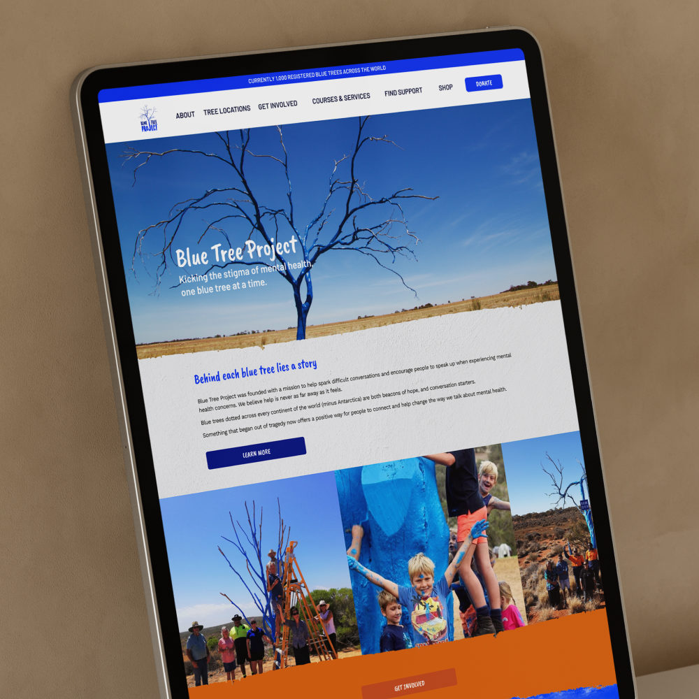
Blue Tree Project is a Perth-based charity with big dreams about spreading awareness and support for mental health through painted blue trees across the globe. Our creative team delivered a website refresh complete with on-brand, custom animated illustrations and natural paint lines for a human touch, highlighting the grassroots and regional foundations of the charity.
Plant With Willow
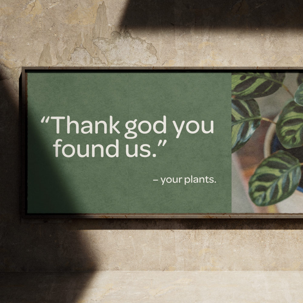
Smart plant sensors need empowered plant parents. Speaking to a predominately millennial audience, the refreshed brand sales messaging utilises conversational, playful and lively energy of the Plant With Willow tone of voice to deliver digestible, down to earth and empathetic content so customers feel heard, not judged (𝘧𝘰𝘳 𝘵𝘩𝘦𝘪𝘳 𝘱𝘰𝘰𝘳 𝘱𝘭𝘢𝘯𝘵 𝘱𝘢𝘳𝘦𝘯𝘵 𝘩𝘢𝘣𝘪𝘵𝘴). 🪴

The Tree House
The Tree House is a collaborative hub in Perth and the official headquarters for The Blue Tree Project charity. After entrusting us with the creation of their new logo for the Tree House, we designed visual branding that spoke volumes about their role in providing support and education for mental wellbeing and health.

